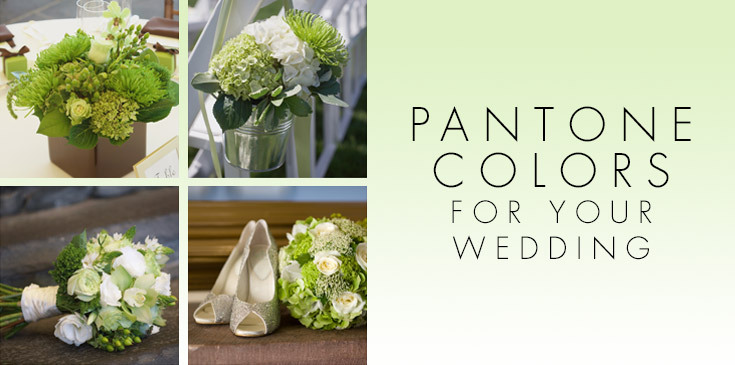
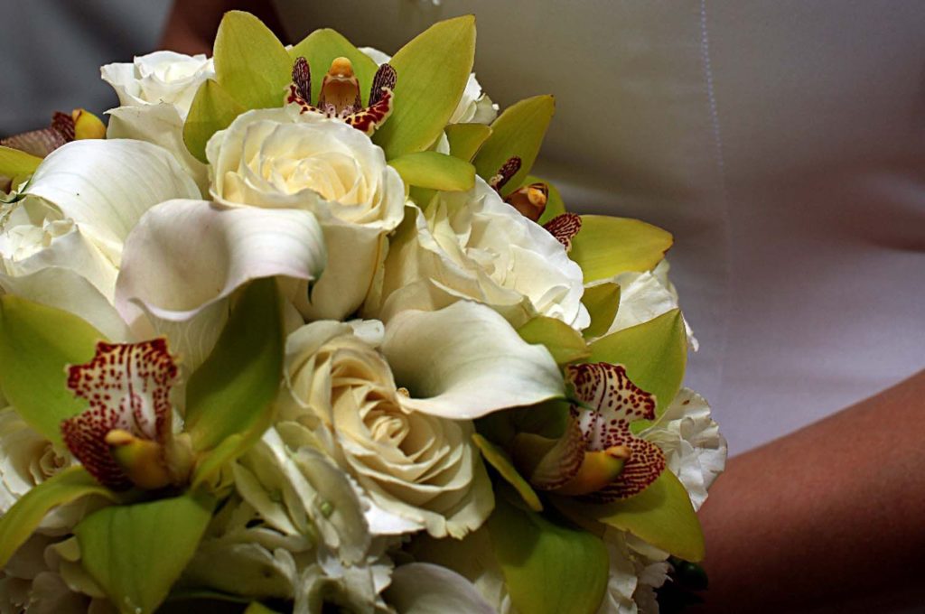
Each year, the Pantone Color Institute issues its list of the top trending colors for the following season. These picks represent the hottest colors in fashion, home design, accessories – and wedding planning! Once the top 10 are chosen, a panel of experts choose the Color of the Year – and this year, that color is Greenery.
Greenery is a yellow-green shade that is similar to chartreuse. Using this unique color in wedding bouquets and decor guarantees a fresh and invigorating color palette which represents all the newness and rejuvenation of spring.
Other colors that the experts expect to see prominently displayed next spring exhibit both subtle and vivid hues; ranging from neutral to neon. The common theme is that all the colors were inspired by nature. For instance, Pink Yarrow is a hot pink shade that is bold and adventurous and is sure to turn heads.
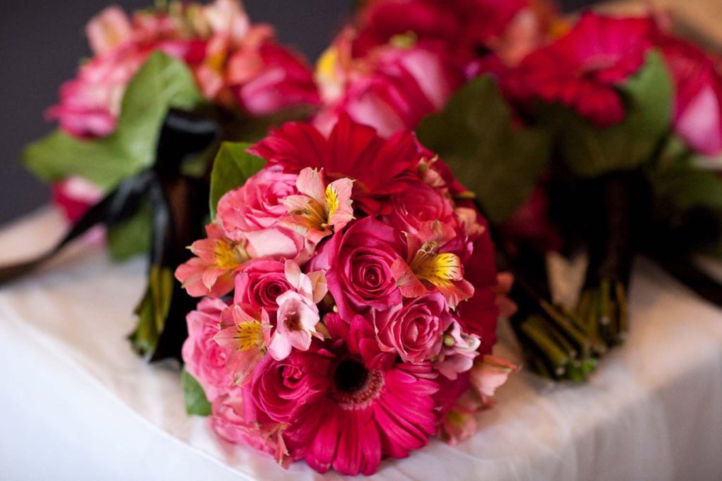
The other bright and vibrant tones on the Pantone color list include Flame, a fiery orange; Yellow Primrose, a sunny and cheerful shade; and Blue Lapis, a deep and intense hue that sets itself apart with rare beauty.
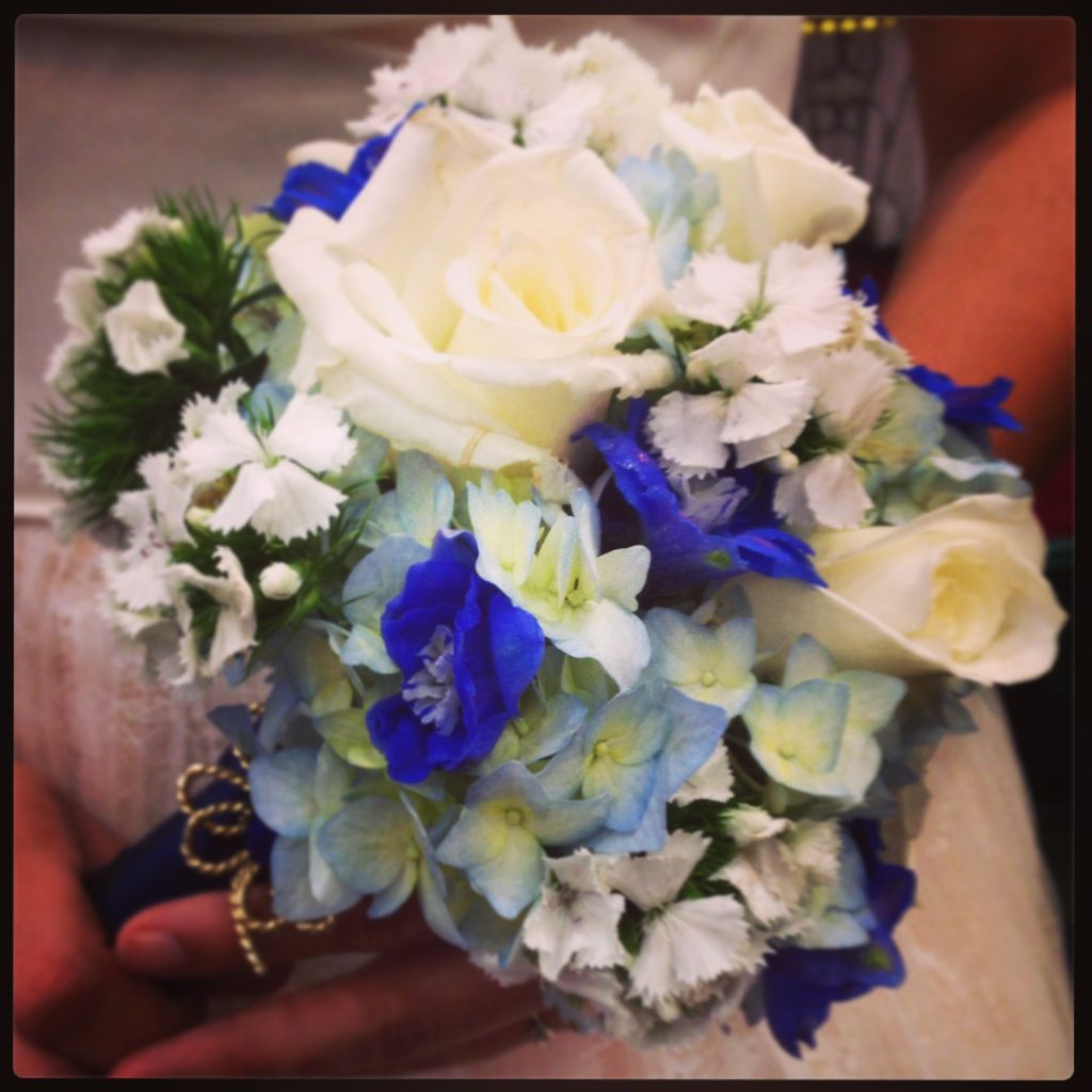
Softer shades include Pale Dogwood (a romantic pink), Island Paradise (a serene aqua), Niagara (a relaxed and comfortable blue) and Hazelwood, an earth tone with hints of dusty rose. The list is rounded out with Kale, a deep green that is reminiscent of a forest canopy.
Greenery is often exhibited florally with the green cymbidium orchid. You can also choose green hydrangea or roses should you choose to go with the hottest shade of the year.
When planning a 2017 wedding, inspiration can come from anywhere. The Pantone Color of the Year list is a great tool to start putting together a color palette for your special day. Choose your colors, then give the professional designers at Griffin’s Floral Design a call. We don’t just arrange flowers, we create atmosphere and ambiance for your entire day – but the flowers are stunning!